Skip navigation

Monthly Archives: October 2009

Gui Boratto, ‘Beautiful Life’

I know I’m a tad behind the curve talking about the new Beatles reissues that hit the shelves last month, but after much deliberation, I decided it would be remiss of me not to mention them somewhere on this blog.

Part of the reason for this delay has been my slow procurement of said CDs. 14 CDs x $12.99 = a lot of scratch. I still haven’t purchased them all (in fact, I’ve only bought half of them, spread out over several weeks), but this isn’t a bad thing. Buying the reissues slowly has given me the opportunity to approach each album with undivided attention and allowed me to absorb and dissect the wonderful remastering job done by the EMI engineering staff. I have to say, they haven’t disappointed yet.

One of the things that kind of blew my mind earlier in the decade was that the Rolling Stones’ catalog got the state of the art remaster/reissue treatment before the Beatles; nothing against the Stones, it’s just that they weren’t really known for their pristine production and creative sound layering back in the 60s, so it didn’t really make a ton of sense to punch up the sound of comparatively simple mixes.

But anyway… I love these reissues. The packaging is great, the sleeve notes are informative, the mini-documentaries encoded in each disc are interesting, and the sound just pops so much compared to the previous 1987 CD releases. Vocal and instrumental parts have more separation from each other now, sound crisper, and things that I never noticed or heard before are now audible. As I said, I’ve only picked up the first seven albums, so I can only imagine how much better the latter seven sound, with all their inherent bells & whistles. That said, these are my Top 10 moments from the first seven discs:

My awesome wife, as a wedding present, landed us third row tickets to see Patton Oswalt perform up in Glenside, PA, just outside of Philadelphia, this past weekend. We kicked off the evening with a stellar meal at one of our favorite restaurants, Horizons. Chef Landau does amazing, magical things in the kitchen—all without the help of animal products. Witness the fitness:

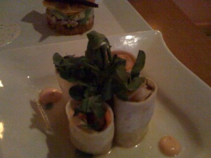
Vietnamese Tacos

Vietnamese Tacos

Vietnamese Tacos with Crispy Lemongrass Tempeh, Sriracha mayo, Daikon, Cilantro, Carrot and Chile

Golden Beets

Golden Beets

Salt Roasted Golden Beets with House Smoked Tofu, Avocado, Capers and Red Onion with Cucumber Dill sauce

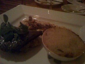
Wild & Tame Mushroom Plate

Wild & Tame Mushroom Plate

Sage grilled portabella over smoked eggplant mash, Braised chantrelles on creamed corn, Oyster mushroom Rockefeller

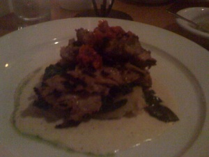
Grilled Seitan

Grilled Seitan

Grilled Seitan with Yukon mash, grilled spinach, horseradish cream, roasted red pepper tapenade

Unfortunately, we didn’t allow enough time for our meal (not pictured: the THREE desserts we ordered: Autumn (Pumpkin) Parfait, Saffron Creme Brulee, and Caramel Apple Cheesecake) to get all the way out to Glenside in time. So we missed the first 40 minutes of Patton’s set. However, the seats were great, and we still got to see the last 30 or so minutes of Patton’s comedy stylings. We were even treated to a few new bits not on his latest album My Weakness Is Strong.

The Once and Future Nerd-king.

The Once and Future Nerd-king.

So, as I mentioned a couple weeks ago, my wife (my wife! That is some crazy, grown-ass man shit!) and I were on the west coast for a couple weeks at the start of September. It was my first time beyond the Mississippi, and for the most part it didn’t disappoint.

We flew into LAX on Sept. 4 and promptly rented a car before heading downtown to the business district, where we stayed at the Biltmore. Fun fact: this was the hotel used for the first ghost-busting scene in Ghostbusters, though it was called the Sedgwick in the film. We stopped off along the way at this amazing Thai fusion eatery called Vegan Glory, which had some truly scrumptious stuff on the menu. I gorged myself on pad thai, seitan tacos and yummy wraps.

We also ate at Fatty’s & Co. in Eagle Rock, which was awesome, and Madeline Bistro (I think in Glendale), which was equally impressive.

I was able to see my good friend Gary, my less-good-friend-because-he’d-rather-stay-home-playing-Beatles-Rock Band-than-come-out-drinking Stuart, and all sorts of La La Landmarks.

We then drove up the PCH to San Francisco, which was amazing.

San Francisco is a pretty filthy city, considering it’s inhabited by enviro-conscious hippies.

The redwood forest was great.

Napa is basically a planned suburb in the middle of a desert. It’s not unlike Northern Virginia, but with fewer trees.

We stopped in Ashland, Oregon for a couple days on our way up to Portland. It was a hippie paradise, full of fearless deer and chipmunks and beggars playing panflutes and bongos on street corners (yes, seriously.)

Portland was kinda meh. Not bad, but not amazing.

A picture says a thousand words. I am about to talk your ear off.

This past weekend, the Redskins bounced back from their embarrassing Week 3 loss to the lowly Detroit Lions with an ugly but desperately needed win over the Tampa Bay Buccaneers. It made me think of my grandfather, a huge ‘Skins booster who never got the chance to see them dig their way out of 17 years of failure and disappointment.

‘Stardust’ by Hoagy Carmichael was one of his favorite songs.

Two entries this week. I suppose this qualifies as the “official” one, as I fully intended to include it after I picked up the album it’s pulled from after I bought it last week (yes, I still pay for music.)

‘Lady Jessica and Sam’ by Hope Sandoval and the Warm Inventions

Orioles magic!

Orioles magic!

I know, I know. Favoritism! Fanaticism! (Un)fairness and (im)balance! J’accuse!

Fair enough. I suppose there’s a certain amount of validity to those sentiments. But let me just point out that in my Top Logos of the NFL countdown, my Washington Redskins only made it to number seven. So let’s just assume I’m being impartial for argument’s sake.

The anthropomorphic cartoon bird was first introduced to fans in 1955, albeit in a much different, less polished iteration. After a few changes (including a simple block letter “B”, and more ornithologically accurate renderings of Maryland’s state bird), the cartoon bird that O’s fans came to know and love through the Earl Weaver era and much of the Cal Ripken, Jr. era was introduced in 1966 and was the mainstay cap logo for the Orioles through the 1988 season.

The Oriole Bird, simply put,  is easily the most friendly and inviting mascot in US professional sports. Bar none. You can keep your Phanatic, your Mariner Moose, your Mr. & Mrs. Redlegs, your Mr. Met, your Chief Wahoo … there is no comparison. The logo represents an economy of color and detail, yet expresses so much character. If it’s difficult to quantify in two dimensions, I highly recommend that anyone who finds themself in the Mid-Atlantic region in the warmer months head to Oriole Park at Camden Yards for one of the best sporting event experiences, particularly to see the Oriole Bird in the flesh (or feather, as it were.) C-Rock knows what’s up.

Bring back the mit!

Bring back the mit!

It’s nothing short of a travesty that the ‘Crew retired this awesome logo. Two bright, primary colors and neutral white, with clean, crisp curves, but nothing really angular. Plus, the coded symbolism; the overt imagery of the stylized ball and mit, but if you look closer, the pocket and thumb of the glove create a “b” and the three fingers clearly create an “m”. And the ball itself uses a swash to denote the seams that’s very similar to number three on our list, the Phillies’ logo.

The fact that the organization moved away from this sort of iconography is depressing and, honestly, completely wrong-headed. The replacement of the bright primaries with the newer muted navy and gold and the use of the wheat (symbolizing the brewing history of Milwaukee) is an obvious attempt by the club to “grow up” and put forth a more mature image. In fact, a lot of major league organizations have done this over the last 10-15 seasons, and it’s a shame.

The fact of the matter is, baseball is a kid’s game. It always has been, and it always will be. And I realize that a lot of people would call this reductive assessment naive, and make claims that it stopped being a kid’s game the second it became a business. But let’s be serious: it qualifies as a business and makes its money as a business because it’s entertaining. It’s fun! There’s a reason sports franchises of the 50s, 60s and 70s used primary colors and cartoonish mascots and logos so much, and it’s because kids love to watch baseball, and that’s where the merchandising money is—in the pockets of parents, just waiting to be spent on goodies for kids.

The game has moved away from this aesthetically, and I’m not trying to draw connections where none exist, but it’s hard not to notice that as soon as teams began moving away from the fun colors and icons that most fans associate with their youth and moved toward the self-serious muted tones that are so chic among marketing and design departments around the league now that it coincided with the proliferation of PEDs like steroids, HGH and the like. I’m just sayin’ that I’m sayin’.

The Big Pink, ‘Dominos’

Airborne Toxic Event, ‘Something New’